Who we are | Our retail range | Our custom work and legal services | Jack Yan’s blog | Contact us
Who we are | Our retail range | Our custom work and legal services | Jack Yan’s blog | Contact us |
|
JY Raj has had a lengthy gestation. The original one was a sans serif
adaptation of a slab serif typeface design by Jure Stojan. The slab serif, which he called Pekel after the town he lived in, was quirky, and in turn had been based on one he used for Christmas cards the year before. |
Jure Stojan, 2002
138 JY Raj package, US$99
|
• Download and license now from MyFonts.com
Also available from our other retailers
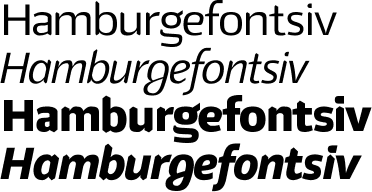
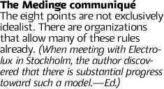
Above: Stojan has created four weights for JY Raj, including an extra bold roman that has sharp forms yet a gentle, legible appearance. Below left: The letter g is highly distinctive, just as it is in JY Koliba. Below right: Four letters that show how how JY Raj breaks from tradition. It is in the overall form that Raj maintains its legibility, not in the outline shape or the stroke width. Bottom: Despite the unconventional forms, it is one of the most legible sans serif typefaces available.
|
| Copyright ©1994–2009 by Jack
Yan & Associates. All rights reserved. All prices in US dollars.
Recommended retail prices shown. JY&A Fonts are completed on FontLab. Please contact JY&A Fonts for multi-user licence prices. |
||