![]()
As well as our collection, JY&A Fonts works on custom
type commissioned by clients—and we have one of the longest histories
Down Under on working on large international commissions.
For any company, custom fonts are often the source of
differentiation in identity and brand creation, or can capture a mood
in an advertisement on television or in print. JY&A Fonts understands.
We’ve also worked on font modifications and ensured
total compliance with the original end-user licence agreements.
In addition, custom fonts can be more cost-effective
for large companies. Owning a font outright can often be cheaper than
paying for multiple end-user licences.
Below is a small selection of some of our projects
over the years—there are more which you’ll have seen where we’ve
been behind the scenes, but have signed confidentiality agreements. Our type has met some of the strictest demands
from extended character sets for eastern European languages, Greek and Cyrillic, to legal requirements
for road signage. We have also consulted on Chinese, Korean and Japanese types for multinationals.
With Jack Yan one of the founders of type design advocacy
group TypeRight, we are committed to
ethical design, which means all our works are strictly original or created
in accordance with the end-user licence.
Please contact us to discuss your commission.
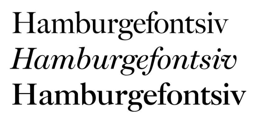
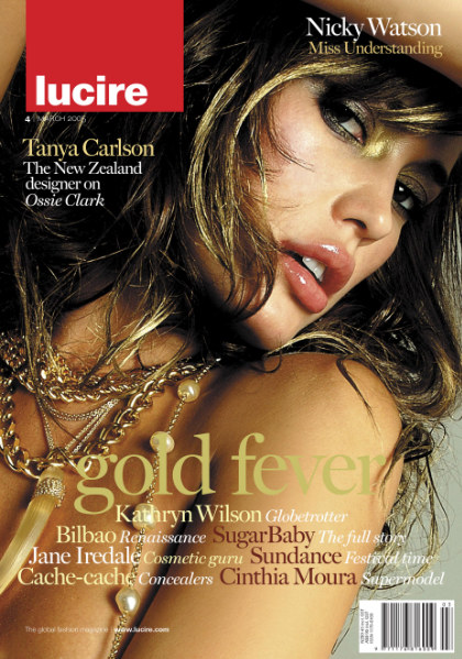
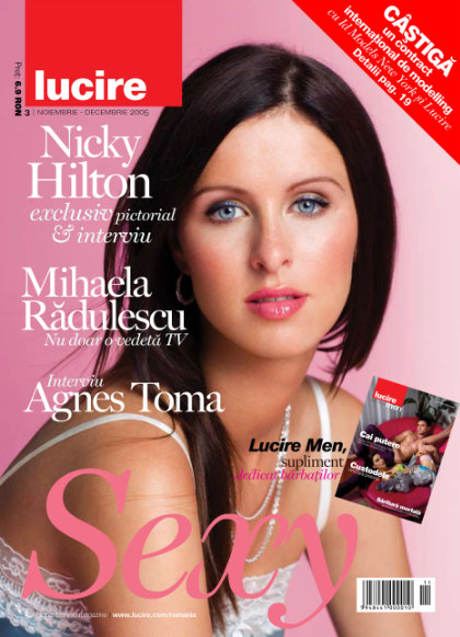
JY Fiduci, for Lucire, 2003–6. Inspired by Caslon and used
for subheadings and callouts in the international fashion magazine (New
Zealand and Romanian editions).

DB Logo, for Typos and Deutsche Bank, 2001–2, with David Philpott, and the permission of Linotype AG. Used for the words Deutsche Bank in the client’s logo. (Photo by Tianmu Zhan/Creative Commons Attribution 3.0 Unported licence.)
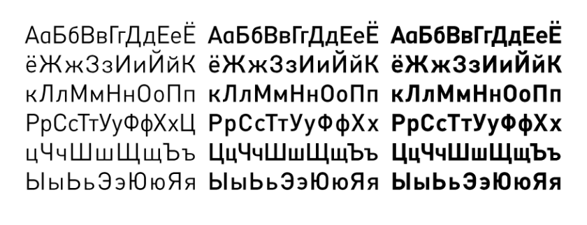
Cyrillic typeface family, for international client, 2009; Latin Extended
set by Wayne Thompson of Australian Type Foundry.
![]()
Transport Medium, for Mission Hall and New Zealand Transport Agency, 2006.
Based on the design by Jock Kinneir and Margaret Calvert. Spacing to New
Zealand regulations.
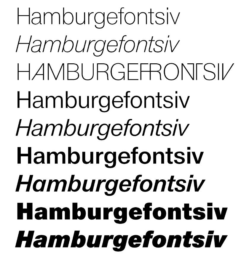
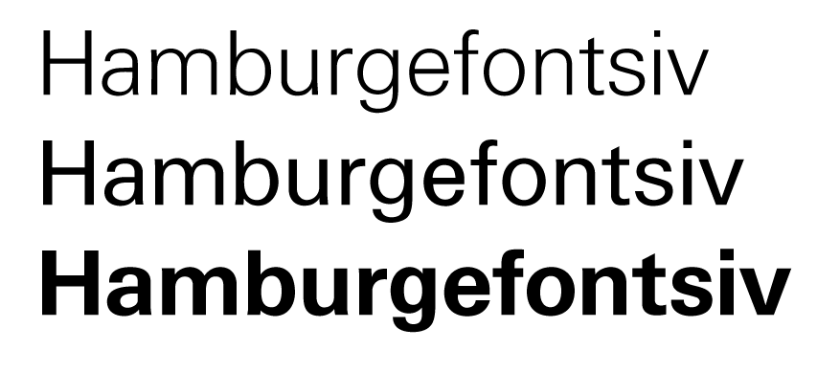
Lucire for Lucire and JYA Creative, 2001–6. Inspired by Helvetica by Max Miedinger and Edouard Hoffman. Selected weights only shown.
National, by Paul Clarke of Paul
Clarke Creative for First National Real Estate, 2001. Legal opinion,
detailed with the client’s permission.
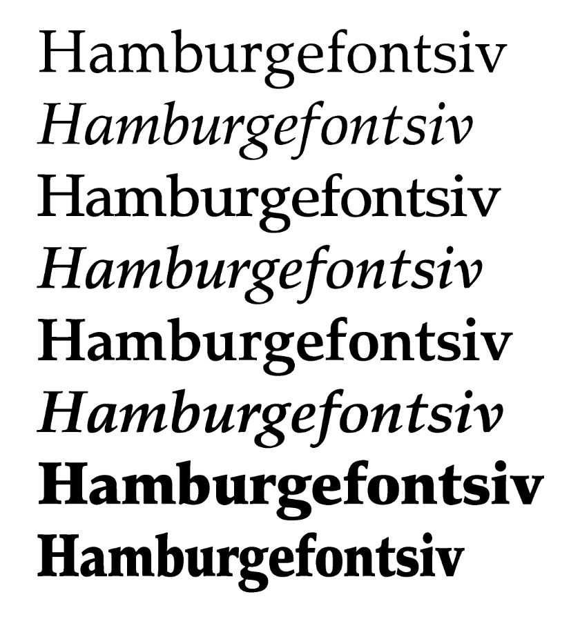
MoneyCenter, based on an earlier design by Monotype, 1996. Experimental commission for Knight–Ridder.
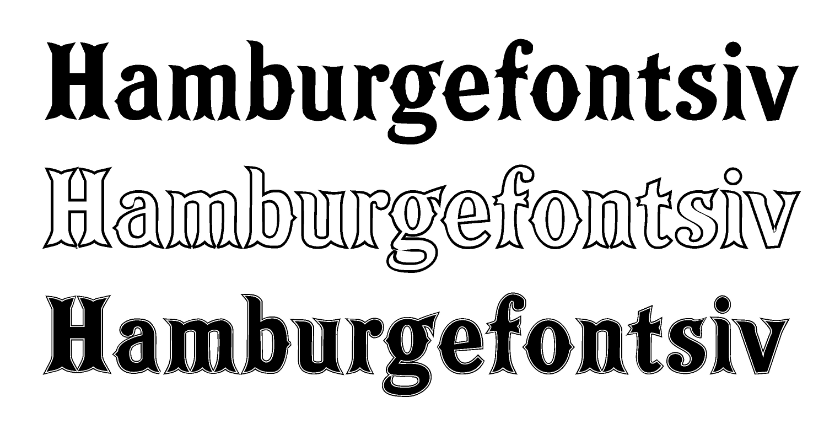
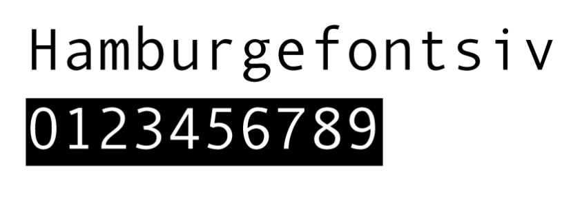
Guildford, for Guildford Grammar School, 2008.
Our range | Our custom work | Our history | Typographic and legal services
Click here to contact us Send us an enquiry
Copyright ©1994–2021, 2024 by Jack Yan & Associates. All rights reserved. JY&A Fonts are completed on FontLab. Terms and conditions of viewing and legal notice.