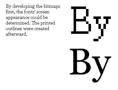


Below: The bitmaps of the fonts were done first. The designers made sure that at large sizes and in print, the typefaces would have a distinctive style.
The creative process
PAGE

 Today's type design sees the drawings of the characters done first, then after digitization the bitmaps are automatically generated. But because of the brief, both Carter and Connare began with the bitmaps - i.e. how the letters appear on screen. The motive was, as Carter puts it, 'to solve the most difficult problem first: how the bitmaps display and space on the screen. Graphic designers are used to thinking of screen fonts as simply the preview mode of printer fonts, which are ultimately judged by how they appear on paper. But many people nowadays work exclusively on screen and never, or seldom, print.'
Connare describes the process: the bitmaps are created first, then they are 'tweaked so we knew what the exact screen small sizes looked like. Then when the outlines are made, they have to be similar to the bitmaps.'
In Carter's words, once the trial bitmap decision was made, 'I can wrap an outline around the bitmap and hint it to recreate pixel for pixel the desired screen sizes.'
![]()
![]()
![]()
![]()
Home
 Copyright ©1997 by Jack Yan & Associates.
All rights reserved. All trademarks are the properties of their respective owners and may be subject to protection in certain jurisdictions. 'Designature', 'CAP' and 'CAP Online' are the properties of Jack Yan & Associates. Email us here.