Who we are | Our retail range | Our custom work and legal services | Jack Yan’s blog | Contact us
Who we are | Our retail range | Our custom work and legal services | Jack Yan’s blog | Contact us |
|
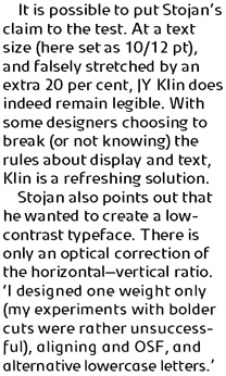
Jure Stojan first created JY Klin for a student magazine in Ljubljana,
Slovenia. ‘It was borne out of my frustration with layout [programs]
and their taste for messing with decent fonts (making the headline occupy
the entire column width at any cost, for instance). Therefore, I designed
a “heavy duty” display font—it can be extended up to 120
per cent without any loss in quality (it is fairly condensed, so no one
could think of squeezing it any further). I even used the font, stretched
by the very 120 per cent, for 10 point text and the result was surprisingly
legible (given some peculiar details prominent at display size).’
|
Jure Stojan, 2003
140 TrueType or PS1 package, US$65
140 OpenType package, US$49 1403 JY Klin OpenType, US$49 (OpenType)
|
• Download and license now on MyFonts.com
Also available from our other retailers
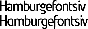
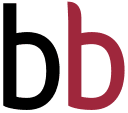
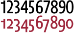
Top: There are distinct design differences between the standard Klin and the Alternative version, but both are incorporated in the OpenType version. Above left: Even letters such as the b show differences, with the Alternative one bearing a more flowing stem and, therefore, cursive characteristics. Above right: The roman version has lining numerals; Alternatives has oldstyle. Below: Unlike most fonts, Stojan’s Klin can be stretched without loss in legibility at text sizes.
|
| Copyright ©1994–2009 by Jack
Yan & Associates. All rights reserved. All prices in US dollars.
Recommended retail prices shown. JY&A Fonts are completed on FontLab. Please contact JY&A Fonts for multi-user licence prices. |
||