Wellington, October 12 (JY&A Media) Slovenian designer Jure Stojan’s latest typeface family, JY Saj, has been released through JY&A Fonts.
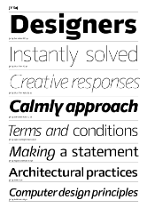
JY Saj is a 10-weight (five roman, five italic) sans serif typeface family that works particularly well on screen and in print, and in both text and display applications. It balances the artistic and the conventional, according to JY&A Fonts’ founder Jack Yan.
The New Zealand-based typefoundry, which has been creating digital type since the 1980s, has several releases by Mr Stojan, dating back to JY Koliba in 1999. JY Saj is an evolution of his JY Raj design from 2001, but with far more weights and its more controversial features, which dated the family, revisited.
The result is a far more practical and legible design, but it retains its artistic flourishes, such as a two-part roman g and a script-like italic counterpart, and a y that flicks rightward.
Each font has c. 3,500 kerning pairs, as well as a comprehensive Latin character set, and euro and rupee symbols. There is a set of lining numerals as well as fully kerned proportional oldstyle numerals. Despite the large family ranging from Ultra Light to Extra Bold weights, Microsoft programs can handle all the variants as well as Apple ones can.
‘In many creative endeavours, the way-out experiments can be considered a step too far; but when some restraint is brought into the process, true beauty emerges. JY Saj finds that balance,’ read the release notes from the specimen.
The word saj literally translates to since, but it can also be used as a short riposte, said Mr Stojan, much in the same way an English speaker says, ‘Quite.’
As with previous releases by Mr Stojan through JY&A Fonts, the original design was done in Slovenia and the finishing, including euro and rupee symbols and the kerning, was done in New Zealand. Testing of the finished files took place in both countries.
The JY Saj family is available at MyFonts, Fontspring, Phil’s Fonts, Typos, and directly from the foundry. A PDF sample may be downloaded from jya.net/fonts, with retail partners linked from jyanet.com/fonts/range.html.
Images
Images for this release may be downloaded at jya.net/info/2017/10/jya-fonts-releases-10-weight-family-jy-saj-by-slovenian-designer-jure-stojan.
JY Saj specimen pages (2017)
PDF, 257 kbyte
About JY&A Fonts
JY&A Fonts (http://jya.net/fonts) is part of Jack Yan & Associates, founded in 1987. It is the oldest digital typefoundry in New Zealand, with its first digital fonts in 1985, and one of the longest-running in the southern hemisphere. JY&A Fonts, which has created typefaces both for retail sale and for private commissions, is known for its meticulous attention to detail, its careful and extensive use of kerning pairs, and elegant, restrained designs. JY&A Fonts represents designs from Jack Yan, Jure Stojan, David Philpott, Greg Bastin, Todd Hallock, Mark Geard, Antonio González de Santiago, and Danielle Smith.
Notes to editors
All trade marks are the properties of their respective owners and are only used in a descriptive fashion without any intention to infringe.
Contacts
Jack Yan, CEO
Jack Yan & Associates
T 64 4 387-3213, F 64 4 387-3213
E jack.yan![]() @
@![]() jyanet.com
jyanet.com
###