Sans frontiers
Creating the sans version of JY Décennie involved more than just taking off serifs
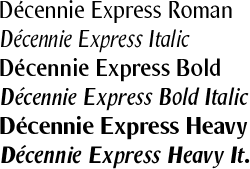
THE DÉCENNIE TYPEFACE family was launched to celebrate Jack Yan & Associates' 10th birthday in 1997. The family, designed with the web-conscious 1990s in mind, was one of the best-hinted JY&A Fonts' families released to date.
Jack Yan's designs have always had an element of timelessness to them. Décennie was a workhorse typeface, originally conceived for an Australian newspaper and displaying regional characteristics inspired by wood type. With the trend towards subfamilies, and the preference of sans serif types online, a sans serif version of Décennie was created, beginning at the end of 1998.
The new family is called JY Décennie Express and not Décennie Sans. Yan explains, 'I wanted to have an original name. "Express" has a feeling of an absence of frills, and utility. The overall effect of Décennie Express is a friendly, approachable type, and I needed a name which conveyed simplicity and ease of use.'
The idea for Décennie Express is, clearly, Décennie without the serifs. 'Décennie may look like a plain typeface family, but when you go up close, it is in fact complex, with straight lines blending into curves. I wanted the sans serif version to keep these traits, because that was what "makes" Décennie. However, most sans serif typefaces are geometrically simple. The casual observer won't notice it, but if you look closely, Décennie Express differs from the Futuras and Gills of this world by being fussy close-up, like its serif counterpart.'
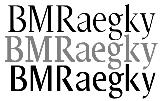
Décennie Titling, Roman and Express compared
'Taking off Décennie's serifs sounds easy, but we encountered some problems. The forms actually changed for some of the letters, no matter how hard you tried to preserve them. There are some common letters: the e and o are common in both serif and sans serif book versionsďż˝the commonality is, after all, the whole reason for doing subfamiliesďż˝but most characters have their own designs.' The overall feel of the original Décennie is preserved, nonetheless.
The greatest departure between the subfamilies is with the numbers. The egyptian-inspired numbers did not lend themselves easily to the "conversion", and Yan sought inspiration from Gill Sans and Futura. This is seen particularly in 6, 7 and 9 in the lining figures.
The family with Heavy weight
|
Yan also added a Heavy weight early in Décennie Express's development. 'Sans serif types are hopeless without one heavy weight. People use sans serif types for headlining a great deal, so we did our first extra bold typeface since the Yan 333 series, which is a "semi-serif" family.'
Décennie Express Heavy has no precedent in the original JY Décennie family and it may be, for some buyers, the reason for getting the family. Being semi-condensed, it does not quite have the weight of Helvetica Black, but on the other hand, it works far better in text applications. There is also a Heavy Italic. Bold and Bold Italic, with a very slight weight difference compared to the serif familyďż˝which Yan says was necessary because of the way the design evolvedďż˝were also designed for Décennie Express.
The italics were the most difficult to design. 'Most sans serif italics are obliques. Even Shannon, which I think is a beautiful sans serif typeface, has optically correct but the italics are based clearly on the romans.
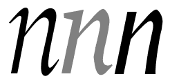
Italics compared: tails and serifs have been replaced by subtle "kinks"
|
There's nothing wrong with that, given the pen-like nature of the design, but for Décennie, this strategy wouldn't work. We set out to do a sans complement of a serif 'face, and not an independent sans. But what do you do? Do you lop off the swashes and tails, just as you would lop off the serifs?'
The solution came not from sketches but from redrafting several versions of Décennie Italic. The definitive Décennie Express Italic has a distinctive "kink", where Yan compensated for the absence of the tails. The italic angle remains the same.
The italic angle identical when compared
Setting in text
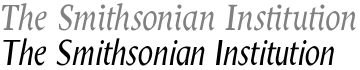
The effect of Décennie is a friendly, casual typeface. Yan believes it is the blending of curves and lines that makes it approachable. 'Look at Evert Bloemsma's FF Cocon. It's wonderful and warmďż˝because it's not strictly geometrical like Frutiger and Helvetica. Décennie Express is the same.'
Décennie Express remains effective even at larger sizes. Yan has chosen not to create a Titling version as he did for the original Décennie, saying that a lighter, headline-only sans will appear in his next type family, possibly a Multiple Master.
'Décennie Express works at large sizes anyway,' he says. 'There aren't big serifs to get in the way, which was the reason we did Titling. The x-height may be a little high but people have become so used to seeing Franklin Gothic, Helvetica, Univers and others in headline form that we thought Décennie Express could do without a Titling version.
'Décennie Express Heavy works well at the larger sizes, and we frequently use it at 18 pt and up.' This frequent use also means that Décennie Express has been fully tried inside JY&A, notably on its web site and some stationery.
An expert set is absent�again, Yan feels it was unnecessary, but he will reconsider if there is demand. There is, however, a small caps font.
Décennie Express fonts have 2,200 kerning pairs each. The kerning pairs have been created with most European languages in mind, so many non-English combinations found in other languages are catered for. The euro symbol is also present, as are five f ligatures.
Target market
The target market is clear: corporate identity and publishing work, where subfamilies are required. The idea is not new, but Yan believes Décennie will be more popular because only it and Rotis are semi-condensed subfamilies, to his knowledge. 'Rotis has its niche,' Yan believes. 'It is more geometrically based, and clearly a design of the 1980s. In New Zealand, the former state telephone monopoly has adopted it as its typeface. It's no surprise-the family is highly flexible. Rotis sells Audis in most of Europe. When people see it, they think, "Vorsprung durch Technik." Or, with my apologies to the late Otl Aicher, they think their phone bill is overdue!'
Visit JY&A Fonts at https://jyanet.com/fonts

Home | Contents | Features
Your feedback is welcome