
The BA symbol - characterized now by the "Speedmarque"

Info to go
CORPORATE IDENTITY consultants Newell and Sorrell can be contacted by telephone on 44 171 722-1113, fax 44 171 722-0259.
BRITISH AIRWAYS has a summary of the new artwork on the tails, which can be found at their site.
OUR articles on British branding can be found at this link or from the CAP contents page.


Timothy O'Neill is one of Ireland's leading illuminators and calligraphers, producing this work in tempera on vellum entitled Colum, 'dove' in Irish, evoking the memory of Columcille, the founder of the manuscript tradition.

Yip Man Yam is one of the most recognized calligraphers in Hong Kong and China, using traditional brushes to create emotive lettering. These characters from a poem by Yip illustrate traditional Chinese calligraphy's dynamic qualities.
 Copyright ©1997 by Jack Yan & Associates.
All rights reserved. All trademarks are the properties of their respective owners and may be subject to protection in certain jurisdictions. They are used here in an editorial fashion only. 'Designature', 'CAP' and 'CAP Online' are the properties of Jack Yan & Associates. Email us here.
Copyright ©1997 by Jack Yan & Associates.
All rights reserved. All trademarks are the properties of their respective owners and may be subject to protection in certain jurisdictions. They are used here in an editorial fashion only. 'Designature', 'CAP' and 'CAP Online' are the properties of Jack Yan & Associates. Email us here.
|
Identity
The greatest interest for CAP readers lies in BA's new identity, created by London-based Newell and Sorrell. With last month's CAP special on the branding of Britain, there were indications that the United Kingdom is not keen on being seen as the country of outmoded traditions and old castles. The new surface shows a youthful, cosmopolitan Britain, confidently looking to the future. The timing of the new identity - a month after the nation's youngest prime minister this century was elected - is perhaps coincidental (Newell and Sorrell has been working on the ID since August 1995) but events have helped. According to Mr Ayling, 'British Airways remains proudly British, but perhaps we need to lose some of our old fashioned Britishness and take on board some of the new British traits. Abroad, people see this country as friendly, diverse and open to other cultures. We must better reflect that.'
Identity consultants Newell and Sorrell added in their release, 'Newell and Sorrell's concept expresses the idea of British Airways as a citizen of the world and it is based on two powerful propositions. Firstly, that British Airways is not just a British airline with an increasingly global reach, but a business of and for the world which was born and is based in Britain. Secondly, that British Airways is not simply a company that promotes and defends its own interests, but a community passionately committed to serving its customers and connecting the different communities of the world.'
However, British Airways is keen to hold on to some traditions. The goodwill and equity attached to the British Airways brand are strong to discard, and the lessons learned by BA through the 1980s also have to remain on the minds of its executives. No matter what the newfound freedom, British Airways faces some state intervention from the new British government through Labour's windfall tax policy. It needs to still work at pleasing the state sector as much as the private one. And, as our second piece on British branding last month showed, there are many qualities of honour and tradition favourably perceived by all people.
What is vital to this new identity is its international feel. This is indicative of BA's desire to be a global player. Also, according to BA, it shows Britain's own multicultural mix. However, the emphasis is on presenting the positive aspects of different cultures and how British Airways truly supports its operations, including its many joint ventures, in different countries. All this leads to a positive image for the 60 per cent of BA customers who are not British.
Given the new direction of BA, a new identity is imperative. Identity professionals know all too well how new corporate liveries are far more than cosmetics or publicity stunts, but form new images and impressions of the organization. There was also a danger that BA's old identity had become stagnant. At the least it would become inappropriate given the new vision.
According to Mr Ayling, 'It goes much deeper than the paint on the aircraft or the ink on our publications. It is the physical manifestation of a fundamental review of our mission, our values and our corporate goals.'
John Sorrell, Chairman of Newell and Sorrell, said, 'The new identity positions British Airways as a citizen of the world. It is an inspirational way of making the idea of the new British Airwars accessible to everyone and acts as a tangible promise of the changes the company will be making as it becomes one of the world's leading 21st century companies.'
There is a greater practical implications and trends at work, too. Pluralism and segmentation in the design and identity industries have seen the demise of the once-powerful "uniform corporate look". The goal of a warmer, more customer-friendly BA has seen to that, not to mention the desire for companies to be seen as decent corporate citizens.
"A major review of the company's strategic direction,' said Newell and Sorrell, 'based on extensive international research amongst customers, revealed that they wished British Airways to be "global" and "caring" in its operations, personality and behaviour.'
Marketing-wise, there is a greater emphasis today on one-to-one marketing, through direct mail or the internet. In the signage and graphic design industries, technology and common software formats have enabled complex images to be reproduced on virtually any surface at any size. Newell and Sorrell has cleverly taken all these trends and created a "personal" feel for each of BA's planes, transferring the one-to-one concept into part of the new identity.
To use the advertising hype, "The aim is to present British Airways as an airline of the world, born and based in Britain, with a community of people passionately committed to serving the communities of the world.'
Changes to the identity include the softening of the colours. BA claims that this was done to reflect the colours on the Union Jack more closely, but more likely softer colours were found to be closely compatible with the youthful, cosmopolitan image the airline is trying to portray. The royal warrant on the aeroplanes' tails has disappeared - again a signal that BA does not want to be associated with the beefeater and black cab image, but that of an innovative Britain. Different BA sub-brands will use different colours, e.g. BA Engineering uses green.
The incised, formal typeface of the old BA (Optima) has been replaced with a softer one, designed by Rodney Mylius at Newell and Sorrell in conjunction with Monotype. While still formal, it appears rounder and warmer. It will appear with four seriffed and four sans serif cuts.
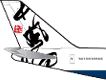
 The "Speedmarque" accompanying 'British Airways' has, according to BA, evolved from the Speedwing symbol on the fuselage of the former identity, introduced in 1984. The Speedwing itself was a development of the BOAC Speedbird. The "Speedmarque" accompanying 'British Airways' has, according to BA, evolved from the Speedwing symbol on the fuselage of the former identity, introduced in 1984. The Speedwing itself was a development of the BOAC Speedbird.
The most significant aspect of the new identity, which will make its way to all BA media, including wallets and baggage carts, are the 50-plus world images created by artists around the world. These world images, according to Newell and Sorrell, is part of the concept of bringing people together.
Says the airline: 'Fifty world images are planned and already 15 have been unveiled, including a tartan from the Scottish Highlands, a tent panel from Egypt, calligraphy from China, a Japanese painting, Delft potteryware, a Polish paper cut, murals from the Ndebele people of South Africa, a wood carving from North America, a painting from the Bush People of the Kalahari Desert, and a stitched Union flag from Chatham Dockyard, Kent, England.' BA claims that this is one of the world's largest arts commissions ever.
Newell and Sorrell went around the world once it had the concept for the world gallery for the airline. Visits to cultural attachés and galleries were followed up by visits to weavers, calligraphers, ceramicists and painters, known and unknown, in different countries.
The cost of the world images and overall design is £2M, with £60M estimated for their implementation. BA hastens to add that the money would have been spent anyway on regular repainting and restocking of stationery, even if the identity had not been changed. The change will also be phased in over three years "to take full advantage of natural wastage and economies of scale.' For example, only 12 images will be introduced each year until 2000 when all 50 will be in place.
It is interesting to note that Newell and Sorrell refer to the use of the world images as part of the customer "experience". This move, toward positive experiences for consumers, is gaining momentum as the new millennium approaches.
Newell and Sorrell has also developed a new approach to photography, focusing on 'documentary style shots of people from around the world,' to be used in printed media.
The international theme continues in BA's branding efforts. TV advertisements have settings in Africa, North America and China but the one unifying idea of "emotional moments", while music arranged for radio spots by Dave Stewart, formerly of the Eurythmics, 'feature pairings of a Greek bouzouki and cello, a Moroccan snake charmer and a jazz trumpeter, a sitar and piano, and pan pipes and a violin.' The advertising is being handled by M&C Saatchi. The TVC was directed by Gerard de Thame and written by M&C Saatchi's creative director Simon Dicketts.
Please note that the illustrations used in this article are the properties of British Airways plc and are used here for news reporting and review purposes only.
|