![]()


|
|
Home | Contents
|
|
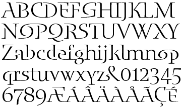
Blue Island, which took three years of design and development, is a typeface made up of ligatures, based on the principle that readers recognize words and not letters. However, Blue Island retains its legibility while providing a distinctive character to headlines set using the typeface. Enigma, meanwhile, is more traditional although plays with the established structures of serif type, providing text with an attractive yet semi-formal appearance. Tankard did not set out to be a type designer. 'When I started looking at type with the interest of designing, I was in my final year at college. My thesis was odd; a collection of thoughts The typeface used was the first version of what became Disturbance 'I was told by my tutors (the graphics ones, not the thesis ones) that "You can't do this to the alphabet. It's ugly. There are reasons for things being the way they are. It's disturbing." Bingo, I had a name for the typeface! 'Another up-shot was to then ignore my tutors for discouraging me to explore typography and not allowing me to engage in free-thinking! This has remained one of my personal drives
With these aims, Tankard began examining type more critically to meet his aims in type design. 'I found the history that mentions Gutenberg's many ligatures, most of which are now dead or not used. I also found other language scripts and experiments by designers including Edward Wright (interestingly associated with the same college I was at and a contemporary of the lecturers who had discouraged me!). Johanna Drucker's The Alphabetic Labyrinth shows many examples of scripts developed as codes and secret writing, etc. All amazing stuff. All pushing our perception of letterforms.' Meanwhile, the inspiration for Blue Island surfaced. 'My eyes are always open to any shape or form that relates in whatever way to language or type, etc. Blue Island grew from some writing I did (I avoid the word poem!) for a projected personal project based on the sea, inspired by various orchestral pieces. This never took off, but remained at the back of my mind. 'A couple of years later I was at Wolff Olins. One project I was working on was for Bulgari. WO were asked to look at strengthening the typography of their name for use in a different market area. One of the ways I drew the name was based upon their jewellery 'After Bliss was finished (a four-year epic), I wanted to do something quick and the total opposite to Bliss. Bliss has no unnecessary ligatures in it, not even fi or fl. Disturbance has 10 ligatures beyond the normal ones. I was interested in the GX substitution technology and the Multiple Master technology. I also wanted to build on word shapes. I realized that GX was a no-no (we'll wait and see about AAT); OpenType wasn't heard of. The only way to make alternatives was to have separate font sets.' Tankard's notebook, dated March 10, 1996, detailed initial notes for this new typeface: 'design a set of letters that flow together'; 'push form and word shape'; 'not Uncial'; 'needs to be elegant. Universal Penman. Bodoni', plus numerous sketches featuring letter combinations and styles.
'I wanted to turn the forms inside out, so certain letters (a, e, o for example) would appear to be made from the strokes of the letters that preceded or followed. The word "top" (right) demonstrates this.' However, the number of alternatives got out of hand and 'too much on the scale of Gutenberg!' remarks Tankard. Eventually, he settled on a few variants and intended to turn it into a Multiple Master (MM) typeface, with a variable weight axis. Since MM was Adobe's technology, Tankard approached the company and received an encouraging letter from one of its designers, Carol Twombly. After a year and a few letters, Twombly wrote to say that Adobe could make a commitment if Tankard would be acceptable to their changes and Robert Slimbach's suggestions on design. Adobe believed Blue Island would be unsuitable for MM, reserving the technology for text typefaces. It also felt the typeface would be too risky and unusual for the technology, and could always add new weights should it prove popular. Further, 'Robert's design suggestions sharpened the forms and balanced the linking letter shapes in visual design with those that didn't carry a great deal of the idea.' After returning from a six-month tour of Australia, Tankard signed the contract and began work on Blue Island in March 1998. 'Inspired by Robert's sketches, I went back to Blue Island and altered the letters with his points in mind. The original version of Blue Island was suffering from one designer, one viewpoint and little discussion. Working with Adobe solved this. The design appraisals that were FedExed back were huge; the smallest detail causes the biggest concern. An excellent education. 'The alphabetic forms were signed off, followed by the accents, sorts and spacing. Adobe then took it in-house around November 1998 to complete the character set, fine tune and fully test it. 'The final design has changed from the initial sketches, as any typeface would and should. It has not changed in its design ambition After three years, the typeface has been fine-tuned in great detail and was finally ready for launch in February 1999.
Tankard says that one could argue that alternatives would have devalued the design idea. Here, no alternative characters are needed to accomplish the ligatured look of Blue Island. 'The final type succeeds with the illusion of letters being created from other letters.' Some words don't work and the problems could have been solved with alternatives, e.g. a reversed o for the word 'gone'. He would have preferred the presence of some alternative characters and then it would be down to educating the user as to how they would be applied. He feels that Adobe may have had considerations of development costs 'and a time limit against the onslaught of OpenType.' However, Tankard feels that Blue Island would be an ideal typeface with which to explore the potential of OpenType. There's nothing official from Adobe but this writer would have to agree. Enigma's gestation, meanwhile, was more rapid, Tankard having begun work on it on May 29, 1998, 'but in reality it has been at the back of my mind since I spent a day in the Plantin-Moretus Museum, Antwerp,' prior to his attending ATypI in 1996. 'There are several pages in my notebook that look at Brokenscript/Blackletter and
It was 'a bit of a gamble,' being a serif letterform, says Tankard. 'Being from a corporate background and one that advocates the sans serif, my instinct told me not to do it. But my beliefs told me to try; as with The Shire Types. I was bored of sans serif typefaces, and for someone who loves type, it's like being on a diet of fish and chips constantly His May 1998 notes include 'positioning of the type, uses, size (range of weights, small caps, etc.), and descriptive words that try to focus on what I want to achieve with it A few pages later, Tankard has made a note to himself: to mix 'rotunda with roman'. Hendrik van der Keere and Dwiggins' names appear. The final result is a typeface with many idiosyncrasies. Sharp cuts appear on c, f and r, and rotunda strokes appear on a, m, n, p, r and u. Foot serifs are missing from k, K and R, and the left bar on the f and t are inverted. The g These were motivated more by Enigma's personality, rather than its legibility, says Tankard. 'Having not been taught calligraphy, I feel free to approach a character's form without the logic of how a stroke would move and be created. The letters are more carved than drawn. Flow and rhythm in a typeface can be achieved many ways beyond the flow and rhythm of what the pen creates. But don't bin the origins all together.' He had also considered how Enigma might look in non-English works and was conscious of keeping the family's appearance constant. While Blue Island has been announced in the United States, its marketing is only beginning to gain momentum and Tankard expects his web site at http://www.typography.net to be ready by mid-1999. Jack Yan is editorial director of CAP. |
External links
Published in association with DZ3
Jeremy Tankard | Typography
Adobe
FontFont
Wolff Olins
|
Send us feedback here. |
 EREMY TANKARD has been behind some of the 1990s' most recognizable typefaces, including FF Disturbance, which mixed upper- and lowercase forms, and Bliss, a sans serif family. Tankard's work has been used widely in advertisements and product branding, and he is a sought-after designer of custom typefaces. This year will see at least two Tankard designs released: Blue Island (through Adobe Originals); and Enigma (to be sold through his own foundry, Jeremy Tankard | Typography).
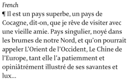
 Jeremy Tankard's Blue Island, released through Adobe Originals, took three years' development
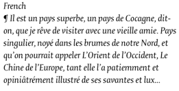
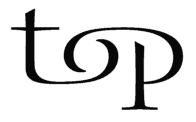 Blue Island's letters are formed from the strokes of those preceding or following
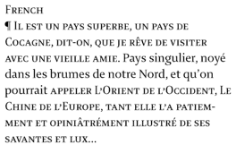
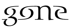 Some combinations do not work