|
Koliba,
from 1940s style to 3,300 kerning pairs
Designed by Jure Stojan, the
new JY Koliba typeface family brings the craftsmanship and structure
of Slovenian architecture together with the personal style of hand-lettering
|
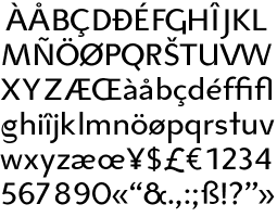
Koliba Roman
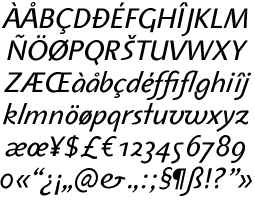
Koliba Italic
Koliba Bold
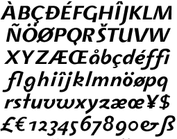
Koliba Bold Italic
|
KOLIBA initially started as an experiment in naïve lettering
and exaggeration, says its designer, Jure Stojan. The design was
inspired by various display alphabets, as showcased on book covers
designed in the 1940s by Slovenian architects.
Unlike Eaglefeather, Tekton and ITC Rennie Mackintosh,
based on the hand-lettering of Frank Lloyd Wright, Francis Ching
and Charles Rennie Mackintosh respectively, Stojans Koliba brings
a taste of southern Europe to the typographic palette. It is also
not crafted after any one architects lettering, but a style which
prevailed in the 1940s. Its characteristics were carefully studied
by Stojan for development into Koliba.
The architectural drawing of that time was meticulously
precise and well organized, a tendency also reflected in lettering.
The era did not see postmodern forms, rather a stricter adherence
to Vitruviuss definitions of modernist architecture.
The lettering has a certain modernism to it, reflecting
the moves that had seen the rise of sans serifs in Germany and the
evolution of functional and democratic design taking place in Sweden
in the early twentieth century. But there is also classicism in
Kolibas design.
The German influence on Slovenia is no surprise,
not least due to geographical proximity. After the defeat of the
Austro-Hungarian empire after World War I, many Slovenian scholars
returned from Germany. Architecture benefited from this, with Ivan
Vurnik, who had worked under Otto Wagner in Vienna, and Joze Plecnik
forming the architectural department of the University of Ljubljana
in 1921.
Plecnik was interested in expressing his architecture
with a modernized classical style, which impacted on the university.
This newfound romanticism with Slavic architecture
was shared with a move toward functionalism in the between-the-wars
period. Students at the University expecting Plecnik to espouse
modernismand finding that he now favoured classicismwent to the
Bauhaus in Weimar and other institutions. August Cernigoj, one of
the alumni, is credited with bringing back the modernist, functionalist
ideals. Others studied in Vienna under Peter Behrens.
Even after World War II, with the advent of the
Socialistic Federal Republic of Yugoslavia, architecture continued
with a modernistfunctionalist ideal.
Thus, certain letters show a tension between (neo-)modernism
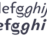
and fussier, classical detailing: witness the g in both roman
and italic, one of the most difficult glyphs to create and in Kolibas
case, one of the most joyful to contemplate.
Like many with an appreciation of the typographic
form, Slovenian architects eschewed the lettering of commercially
available stencils and developed their own typefaces.
|
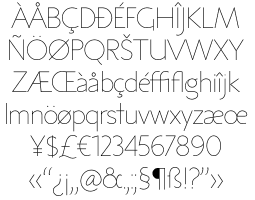
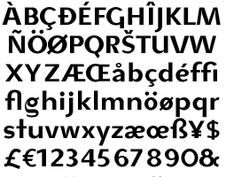
Koliba Ultra Light
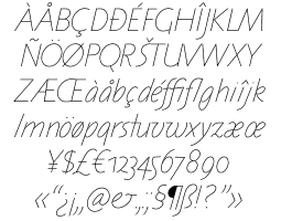
Koliba Ultra Light Italic
|
The letters were geometrically constructed in
two weights; today we would call them Thin and Bold, says Stojan.
The thin letters were mostly used in titling,
whereas the more complicated bolder forms signified sections in
construction plans.
Even today, two weights can be seen in plans where
hand-lettering has been used. Expectedly, the styles are personal
to their scribes.
As with graphic and fashion design, 1940s Slovenian
architecture could be seenat least from the viewpoint of a writer
in the 2000sas an adaptation of a Zeitgeist, or the mood
of the times. It is something that cannot be readily said today,
when tastes have become more evidently pluralistic, even though
countries in the developed world are growing closer technologically.
Would it then be fair to place a postmodern label
on Koliba, with the reference to classicism, particularly in the
itaic, and its intent for twenty-first-century computer usage? Its
varying angles, one for uppercase and a second for lowercase, are
reminiscent of the model serif italic forms of centuries past.1
The tag may not be unwarranted.
If it were not for postmodernism we might not
have Koliba, a typeface family that does not really separate past
and present, instead treating all moments of time as relevant in
a modern typographic dialogue.
Therefore, Stojan rightly insists that Koliba
is not a revival. The letters are simply constructed in the manner
of the 40s, using architectural templates featuring ellipses.
This is particularly evident in that distinctive letter, g,
in both roman and italic, in p and q, and equally
so in all the numerals. The straight-edge characters show a rigid
design: A, K, M, N, V, W and Y have a strict, unbending
feel to them.
The designs were completed on computer by both
Stojan in Slovenia and JY&A staff, including founder Jack Yan,
in New Zealand.
With type design moving into a more personal and
"crafted" realm in the 2000s after a decade of chaos,
Koliba is very much a creation of, by and for its time. It is regimented
and structured technically yet retains a friendly, warm, personal
feel.
The relatively wide body of the book and bold
weights suggest excellent use for text. Koliba Ultra Light, reflecting
the titling typeface made by an architects pen, is narrower and
true to hand-lettering habits (the larger the letter, the narrower
it is, and the thinner the strokes proportionally).
The typefaces will find favour with designers
who seek a warm yet disciplined style. Koliba will sell internationally
through JY&A Fonts network of distributors, on- and offline.
Visit
https://jyanet.com/fonts/font136.htm
for more details.
This
article was originally written for the print edition of CAP.

Home | Features
Your feedback is welcome
|