


'I had hoped that at large sizes, the outlines might have some typographic personality to distinguish them from plain vanilla' - Matthew Carter
The method of working, Connare believes, brings new possibilities to the design of sans serif types.
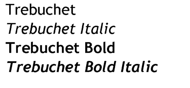
Vincent Connare's Trebuchet had inspiration from signs on the freeway as well as unlikely sources such as the seriffed family Cheltenham
In print
PAGE
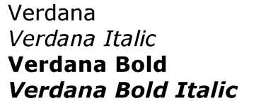
Verdana's creation called on Matthew Carter's experience in creating the Bell Centennial typeface for telephone books
![]()
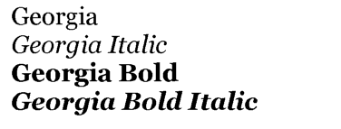
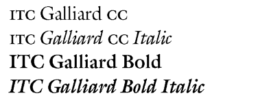
Matthew Carter's Georgia (above): influenced by Matthew Carter's upcoming Miller - and smartly complementing, in print, the same designer's ITC Galliard CC (below)
![]()
The outline was necessary, too, as there was the chance that the typeface would be used for print at higher resolutions. Bitmaps would be far too coarse for the printed medium, as those who recall the principles of dot-matrix printers will know. Here, design issues more familiar to printed type designers come into play.
'I had hoped that at large sizes, the outlines might have some typographic personality to distinguish them from plain vanilla,' says Carter. The finished outlines already owe little to other designs because of their screen-first creation process. 'I suppose Verdana shows some influence of Bell Centennial, another "problem-solving" sans serif.' Carter had created that family earlier for use in telephone books, using ink traps and resolution points (to the layman, "holes" and "edges" in each character) for a sharper effect.
'At the time I started Georgia I had been working on a new retail family (called Miller, still not released) which is a version of Scotch Roman. I have always admired Scotch, particularly in its early forms as cut by Richard Austin for Bell and Miller.' Certainly the influence of Scotch Roman is evident with Georgia's high legibility. The smaller sizes cut by Austin in the early nineteenth century reflect some aspects of Georgia.
The writer took the opportunity to try out Georgia in print, and found it readily fulfilled Carter's aim to furnish the family with personality. In one print publication an 8/9 pt Georgia (for captions) was successfully paired with ITC Galliard CC (issued by Carter & Cone).
Trebuchet has historical origins as well, for instance in Edward Johnston's London Transport Authority typefaces used on signage. Connare admits that he 'travelled the London Underground loads of times the Christmas before working on the 'face,' and felt it did influence him. The second influence was the 'road signs while driving home from work to Seattle. I know the lowercase "e" unconsciously comes from the interstate signage on US highways.' The road signage influence is present with Trebuchet being able to communicate quickly, with stronger differentiation between "i", "I", "1" and "l" - this was evident in Jock Kinneir's typeface for British motorway signage.
'My main goal,' continued Connare, 'was not to completely match either Verdana or MS Sans. The lowercase "g" actually has its origins in an odd place. I have a fondness for the ATF history and often look through Mac McGrew's American Metal Typefaces of the Twentieth Century. The "g" came from [the typeface] Cheltenham.'
The method of working, Connare believes, brings new possibilities to the design of sans serif types. Sans serif types are those "without tails", to put it crudely, such as Helvetica or Univers. There is a perception that sans serif types, because of their simplicity, are becoming difficult to design. However, 'after working on screen issues and looking at grotesque [a particular category of sans], I came to love Akzidenz Grotesk and Alternate Gothic,' says Connare. Further, because of his involvement with Verdana at the early stages, Connare found ways to further differentiate Trebuchet from Verdana.
As to the name Trebuchet, it is defined as 'a medieval engine that launches missiles. I thought that would be a good name for a font that launches words across the internet.'
Carter believes there are possibilities with sans serif designs. 'Most readers of books and other paper documents are conditioned to find serif 'faces more readable than sans serifs in continuous text. On the screen, the opposite is generally the case because the serifs, which are unavoidably the same weight as the main stems of letterforms at text sizes, tend to be too prominent. Sans serifs, precisely because they have no serifs, tend to be clearer and easier to read.'
![]()
![]()
![]()
![]()
Home
 Copyright ©1997 by Jack Yan & Associates.
All rights reserved. All trademarks are the properties of their respective owners and may be subject to protection in certain jurisdictions. 'Designature', 'CAP' and 'CAP Online' are the properties of Jack Yan & Associates. Email us here.
Copyright ©1997 by Jack Yan & Associates.
All rights reserved. All trademarks are the properties of their respective owners and may be subject to protection in certain jurisdictions. 'Designature', 'CAP' and 'CAP Online' are the properties of Jack Yan & Associates. Email us here.