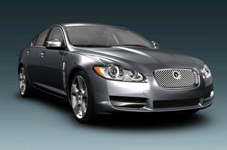
The curvature of the side can be seen in this shot: the Jaguar XF has a fullness to its panels, especially its doors, as British cars tend to.
Jack Yan
JY&A Consulting
Jack Yan analyses the design of the new Jaguar XF, the second sign of the company’s renaissance
Jack Yan
Jack Yan is founder and CEO of Jack Yan & Associates and president of JY&A Consulting.
One of the reasons Jaguar found itself in so much poo is that the cars, for
many of the years Ford has been in charge, looked as though Arthur Daley should
be driving them. When there were promises of a ‘new Jag generation’ with the
launch of the X-type, projected to steal BMW 3-series sales like crazy, Jaguar
showed a car that looked for all the world like a scaled-down XJ6.
The rest is history: Jag has bled a lot of money, the X-type
wound up cannibalizing sales from the larger Jaguars and did little to touch
BMW sales, and parent company Ford wants to sell it off, with Hyundai and Tata
saying they’re interested.
Which is a bit of a shame at this point, because Jaguar, with
its design under Ian Callum, is getting things right.
Callum, a softly spoken Scot, has hankered after the design
director’s job since he was a child in the 1960s, sending in fairly promising
sketches of future Jaguars to Browns Lane. When Geoff Lawson, the man who penned
many of the retro Jags, passed away, Callum, who had designed the Aston Martin
DB7, got the gig.
The first all-Callum Jaguar was the XK8, selling under the
‘Gorgeous’ campaign that was panned in the blogosphere by many except for yours
truly and a small minority, predicting that buyers were sophisticated enough
to get it, and that it would spark off a renaissance. We were right and the
doomsayers were wrong, largely because we knew that there was a product that
looked the business.
Sure, the XK8 may be a bit behind the times dynamically even
now: the XKR’s block isn’t as high-performance as what the Germans can muster
and the cabin still feels a bit old-hat, for instance, but the lightness and
the way the car puts the power down still make it a credible buy. Jag is still
struggling in this sense, but it is struggling with a lot more style than the
days of the X, S and X300.
Callum has done what Jaguar should have been doing since the
1970s: move forward but do so with a sense of timelessness. The Jaguar XK8 was
the first sign of that: the nose might be high for pedestrian protection laws,
but he’s endowed the overall shape with a litheness that comes from the length
of the bonnet, the relative straightness to the rear haunches, and the illusion
of a tail that has been cut off, even though it is rather commodious and can
fit golf clubs within. The detailing is futuristic, with the gills and the way
circular lights run into straightened forms at the back of the car, but the
proportions are classically British. One might even say there is a sense of
E-type to it all, but without the rehashing that the old XK8 was known for.
One could say that pre-Callum Jaguar had become worried because
its last timeless car, one with the sense of thrusting into the future, was
the XJ-S (later hyphenless as the XJS). Squared-off lights and those flying
buttresses might have been cool under development in the early 1970s, but when
1975 came around, a thirsty grand tourer that didn’t look like an E-type wasn’t
what buyers expected. The XJ-S might have been more aerodynamic than the E,
it may have been lithe in that the waistline looked close to the ground, and
it may finally have come good through facelifts toward the end of its life,
but in the 1980s Jag got scared.
The XJ40, running about 10 years late, was launched to British
media trying to sound optimistic and German media having a snigger at this new
form of British humour. The cars were not well built till Ford came on board,
and stylistically, the XJ40 could best be thought of as a mid-life update to
the 1968 XJ6. Surprisingly, the XJ40 and its variants lasted into the 21st century,
influencing the style of the X-type and that other oddball Jag, the S-type.
The S-type wasn’t sexy, it was dumpy. It didn’t have the excitement
of anything you might have seen on Z Cars. You couldn’t picture Maximillian
Schell drive it to escape Edward Woodward in the Callan remake. It was
a retro Jag, and unashamedly so, though it did have that funny sense of XJ-Sness:
it would probably wind up being quite coveted and considered quite timeless
come 2015. The re-engineered models were actually very, very good, even if they
looked like the old. But buyers, used to the geometry of the Audi or the fussiness
of the BMW, stayed away. The Audi A6 looked so much better.
So when Jaguar launched the S’s replacement, the XF (sounds
like a Falcon, but then, Jaguar is still owned by Ford), Callum had to get it
right. We know that Jaguar can get the dynamics sorted, but the new car had
to establish a design language for the brand in the way the XJ6 did in ’68.
It had to be a close-coupled sporting saloon; it had to have express the triple
stars of grace, space and pace. The trouble with Jags under Lawson was there
was plenty of grace and space in the look, with the curvature of the panels
and the shape of the bonnet, but not a lot of pace. Callum was set to change
that.

The curvature of the side can be seen in this shot: the Jaguar
XF has a fullness to its panels, especially its doors, as British cars tend
to.
Not long ago, I was following an X-type in a brand-new Mercedes
C200 Avantgarde. And it struck me how old-hat the British car was. The Mercedes
was boxy-cool, reminding me of when curvy cars were considered passé
and ugly in the 1970s. The S-type suffers the same fate right now in 2007 and
the shape of the XF becomes more understandable when one considers where our
tastes reside.
‘This is the new Jaguar,’ proudly proclaims the official website.
It doesn’t refer to just the car. It refers to the whole company.
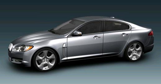
Whereas the character line of the S-type went downward toward
the back, it goes up to form a wedge for the XF, contributing to strong DRG.
The XF, at a glance, is a wedge-shaped saloon. The curves of the S-type, droopy, downward (intentionally done to remind people of the Mark II), are replaced by graphics that go upward. What marks it out as British is the fullness of the panels—it’s something that can be found in everything from old Humber Super Snipes to the 1968 XJ6.
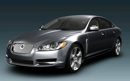
The round lights hint at the heritage but in a postmodern way;
the new grille will be a more familiar sight if Ian Callum has his way.
At the front, there’s a new Jaguar design language. The grille
is squared off: no more S-type retroness, a cue taken from the Jaguar 2·4 and
the Mark II. The circular lights poke out of otherwise trapezoidal units, their
apexes hinting at Jaguars of old but interpreted in a 21st-century way. Its
nose pokes proudly forward, but the side of the car starts where the metal creases,
giving the illusion that the front wheels are more toward the leading edge of
the car than they really are.
The Jaguar gills have become part of the design language of
the brand, too, with the marque’s name proudly in the chrome. The glasshouse
is coupé-like as Jaguar tries to express the idea of a sporting saloon.
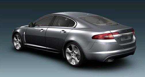
The coupé glasshouse and fastback design have to be considered
with the rest of the car’s graphics.
The concept of taking a coupé glasshouse and turning
it into a saloon is nothing new. The 2·4, later titled the Mark I, had adapted
XK120 styling. This is just a modern take on the idea, done without any old-Jag
generation dullness.
The C-pillar may remind some of a Bavarian brand with its
kink; it’s been reinterpreted in everything from Toyota Coronas to the latest
Holden Commodores. It cannot be taken in isolation, fortunately: once the lower
part of the car is considered, you can see the waist dip ever so slightly, another
nod to cars like the XJ6. Again, it’s not done in an obvious way, which contributes
to the future-looking nature of the car. The bootline flows neatly from the
C-pillar, with shades of the XK8.
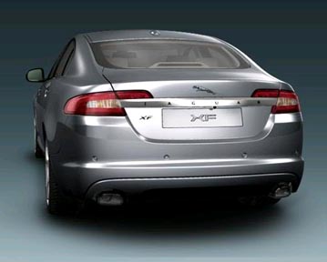
The signature blade is a new Jaguar design feature and the name
must be repeated, according to Callum, for those who do not realize this is
the direction the marque is heading in.
Head to the
back and there’s more of the new Jaguar language: a boot-wide chrome strip with
the name repeats itself. The company calls it a ‘signature blade’. Callum says
this is necessary because people don’t know what new Jags look like, so it has
to be spelt out. The leaper badge is also repeated for those who are illiterate.
The boot shape scoops inward, again not unlike the XJ6’s, but the light shape
is new and without precedent for Jaguar.
It makes you wonder what the future XJ8 is going to look like
if Callum gets his way. The man should continue to—it’s his dream job, after
all—and while he remains design director, we should have a solid generation
of futuristic yet timeless Jaguars. Mark my words: in a few years’ time, the
XF will be considered "recognizably Jaguar", even if those firmly
glued to the past cannot see enough shades of the 1950s and 1960s in this model.
It’s a pity that after sinking billions into Jaguar, Ford
is losing its bottle due to mismanagement and politicking in Dearborn. But there
is nothing to say that the company will not fare well under eastern management.
If it keeps churning out motors like this, why would anyone tamper with the
gold-egg-laying goose? Even if those eggs are wedge-shaped?