 TWO
of my predictions came true this year. One was that Harper’s Bazaar,
with its February 2000-launched masthead, would not do too well. That led to
the news that editor-in-chief Kate Betts would not have her contract renewed.
The second, which I committed to print in Visual Arts Trends early last
year, has come early: that Harper’s Bazaar would require a redesign because
the 2000 effort wouldn’t last.
TWO
of my predictions came true this year. One was that Harper’s Bazaar,
with its February 2000-launched masthead, would not do too well. That led to
the news that editor-in-chief Kate Betts would not have her contract renewed.
The second, which I committed to print in Visual Arts Trends early last
year, has come early: that Harper’s Bazaar would require a redesign because
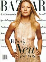
the 2000 effort wouldn’t last. I predicted the latter for 2003, but with the changes made by new editor-in-chief Glenda Bailey, there is a new Bazaar. As with February 2000, Gwyneth Paltrow is on the cover (an actress I declined to put on Lucire’s recently; let the American media champion their Gwyn). But we see the welcome return of the original masthead, in the HTF Didot typeface, gracing (is there a better present participle here?) the cover.
I must have given about 12 or more lectures since February 2000 on the faults of the "other" masthead, which must now rank as a black-sheep version or a bad experiment. But in each lecture I gave the designer the benefit of the doubt. ‘Maybe he’s trying to redefine the market-place.’ ‘It’ll give the magazine greater differentiation.’ But I always qualified it with, ‘It doesn’t say what the magazine truly is: establishment.’
Every student of typography will know two facts: one is that the selection of a typeface is partly subconscious, partly logical and partly competitive; the second is that typefaces convey the social position of the piece, determined by the reader’s upbringing and earlier influences. It is as much common typographic and design knowledge as the fact that Bill Cosby looks less menacing in his trademark woolen sweaters.
Still, if there weren’t failures then Harper’s Bazaar would never know it had once tried to push the envelope, to lead instead of following (even if the use of a modern typeface, such as HTF Didot, was established by the magazine’s legendary Ukrainian art director Alexey Brodovitch). That in itself is refreshing, even if the magazine paid for it with circulation and money, those determinants of an editor-in-chief, and, as it turned out, an art director’s careers.
But why was it such a bad idea? I’ve dealt with the design elsewhere but Harper’s Bazaar forgot that the visual expression of any product must match the product. Yes, Ms Betts did change the magazine after Liz Tilberis died; she had moved Bazaar on after Karin Upton Baker, then-editor of Harper’s Bazaar Australia, came in as a caretaker with the mission of keeping the Liz formula going. But she hadn’t revolutionized it. Harper’s Bazaar had a core readership that needed to grow. To get them, it packaged its product differently, but it was fundamentally the same—at least when it came to casual readers like me.
And it wasn’t that adventurous design-wise. The magazine didn’t suddenly go grunge. It wasn’t Ray Gun on steroids. No: it was well-ordered—which didn’t explain the godawful masthead and the choices of typeface.
In a recession, Harper’s Bazaar’s adventurous experiment would probably not go down that well, either. It’s like dressing sexy at a time when the mood is somber. It’s all right if you’re the Hilton sisters and terrorizing the social scene, but it’s not all right if you’re trying to be the grande dame as well. And that was where Bazaar was at: a brand undefined, through no fault of any one editor-in-chief or one art director, but the way things just didn’t gel.
Art direction of a magazine, like any other discipline, is one where identity and branding are paramount, along with the theories behind them: organizational vision, marketing strategy, typography, graphic design, image, marketing performance, tracking. Bazaar expressed this more than any other.
 And
of the new Bazaar? The story is not unlike that of Colombe Pringle’s
last Vogue Paris. The French edition went avant-garde for 1994, using
Akzidenz-Grotesk and Garamond—which, incidentally, are typefaces that the new
Harper’s Bazaar has adopted along with Linotype Didot (right)—using
asymmetric layouts, white space and other DTP-layout-inspired features. It didn’t
work, even if the magazine looked cooler than it ever did with the staid and
same-again-in-fashion Berthold Bodoni Antiqua. Pringle found herself out of
a job and Joan Juliet Buck and Donald Schneider came in. The magazine promptly
went back to the pre-1994 look. In fact, it probably went further back in time,
looking duller than it ever did artistically. I didn’t buy any more after that,
but maybe the experiment in design mediocrity worked: (a) we are about fashion
so look at the photos because the Newhouses paid a lot for them; (b) we are
the establishment and now we look it.
And
of the new Bazaar? The story is not unlike that of Colombe Pringle’s
last Vogue Paris. The French edition went avant-garde for 1994, using
Akzidenz-Grotesk and Garamond—which, incidentally, are typefaces that the new
Harper’s Bazaar has adopted along with Linotype Didot (right)—using
asymmetric layouts, white space and other DTP-layout-inspired features. It didn’t
work, even if the magazine looked cooler than it ever did with the staid and
same-again-in-fashion Berthold Bodoni Antiqua. Pringle found herself out of
a job and Joan Juliet Buck and Donald Schneider came in. The magazine promptly
went back to the pre-1994 look. In fact, it probably went further back in time,
looking duller than it ever did artistically. I didn’t buy any more after that,
but maybe the experiment in design mediocrity worked: (a) we are about fashion
so look at the photos because the Newhouses paid a lot for them; (b) we are
the establishment and now we look it. So Bailey’s Bazaar is of that ilk: a safely, safely trek to more evocative times, using the Brodovitch-inspired, Hoefler-digitalized masthead, more conservative type choices and instant familiarity. Nothing exciting, artistically, but Lucire’s fount of fashion features, Phillip Johnson, gave it the thumbs-up when I spoke with him today. It works, because it’s Bazaar: a return to what it knows and hopefully, the Avis rule will apply: ‘We try harder.’
The cover works. Ms Paltrow looks about as characterful as a Chinese rice pudding but she’s helped by the split-line Linotype Didot Italic text—not to everyone’s tastes but the message to me is: the type style you’re so familiar with is back. It’s the second rule and there are enough readers who understand it.
It looks establishment. Its features hold the institution together, with a bit of celeb-kissing thrown in. (Who doesn’t kiss celebs now in that market?) There are beautiful photos by Terry Richardson. And a layout that obeys the rules because Harper’s Bazaar is about defining the rules. (I know, I know: ‘We don’t dictate!’ But we on the fringes in the independent press think you do.)
Content-wise, there’s less dumbing-down. The articulate Georgina Howell looks at Frida Kahlo: for great research, it’s hard to go past Georgina. The type is Adobe Garamond; ITC New Baskerville, used in the Betts days, takes up more room. (New Baskerville was the smart-ass student’s typeface of choice when I was at law school: it made your papers look bulkier because you’d get fewer characters per line. Oh, I was the smart-ass law student.) If you have a lot of pages and it’s in Garamond, it’s bound to be meaty. Let’s face it: people don’t really want dumbing-down. Not at $3·50 per issue. And right now, we want to be a little safer and not sense that we’re under siege, which is how the east coast still feels.
In a recession, and in a post-September 11 world, when we look to the past with even rosier glasses, when Hovis Bread and Dvorak’s New World Symphony go together with sepia tones, familiarity mightn’t breed contempt—it might breed sales. Hearst, Bazaar’s publisher, is betting on it. •