Biblical saga
One of the grandest books to
be published in 2000 is the Arion Press Lectern Bible, after
two years of production. Four hundred owners—from churches
and libraries to bibliophiles—will have paid over $7,000
each for the privilege of owning this edition of the Word. Jack
Yan reports
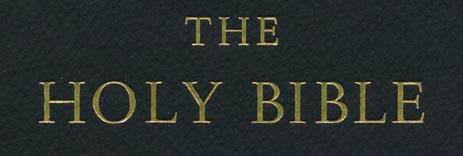
Above: From
the cover of the Arion Bible: embossed gold lettering
THE ARION PRESS Lectern Edition of the Holy Bible, in the New
Standard Revised Version, will probably be the last lectern
Bible to be produced using traditional methods. This limited
run of 400, with pricing varying between $7,250 and $11,000,
will no doubt be regarded as one of the finest examples of book-making.
Even its typesetting was done with hot metal (7,000 lb
of it), but with a twist. The folio pages measure 18 by 13 inches,
printed on a luxurious Somerset cotton-fibre wove stock at 115
g/m�. The finished bible weighs 25 lb, with over 1,200
pages.
There�s a sense of irony to find a fine press
located near San Francisco�s Multimedia Gulch. But Arion Press
knows its customers�from high-echelon book collectors to libraries,
there is demand for what it creates: the finest, most lavishly
crafted books to come out of America.
It seemed a fitting way to finish the last
millennium, one which began with the birth of printing in China
in the 10th century, before the technique made its way to the
west in the 15th, with Johannes Gutenberg�s 42-line Bible, using
similar technology. Since then, we have seen other landmark
editions of the Bible, including the John Baskerville English
Bible of 1763 and the Oxford Lectern Bible by Bruce Rogers in
1935, known to many bibliophiles around the world.
Founder and principal of the Arion Press,
Andrew Hoyem, was very conscious of past Bibles. The Arion Press
site has a detailed history of previous Bibles, researched carefully
by the company�s staff. �This was done over many years, long
before I thought it might be possible to produce this folio,
while studying the history of printed books,� recalls Hoyem.
�In preparation for this project my long-time
associate, Gerald Reddan, who is shop foreman and the primary
printer, and I went to look at several significant Bibles at
the San Francisco Public Library. Our editor and primary proofreader,
Stephanie Dal Porto, and I have worked closely with the text
and footnotes to understand what the translators intend and
to be able to question them when necessary. This has involved
consulting different editions of the NRSV
[New Standard Revised Version] and in some cases comparing the
NRSV with other translations.� When inconsistencies
were found at Arion�s proofreading stage, they were reported
to the National Council of Churches, to be incorporated in future
editions of the NRSV.
The Arion Press Bible will join this lineage.
It may be remembered as the last to be produced with these techniques;
or it may be remembered as one where the Apple Macintosh was
brought in to work with the nineteenth-century typesetting methods.
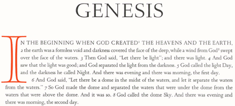
Above:
From the Book of Genesis, the headline typeface in Romulus shown.
The initial cap is designed by Sumner Stone.
THE contraption taking care of the typesetting looks like something
out of a 1940s science-fiction film. The Macintosh is hooked
up to what looks like valves and tubes, connected to a Monotype
casting machine, which takes the metal and turns it into individual
characters. Running a program named the �MonoMac�, developed
by retired engineer and printing hobbyist Monroe Postman, the
Mac is interpreting the NRSV Bible text.
As Hoyem explains, �This program drives the
Monotype caster, providing equivalent information to that ordinarily
supplied by the punched paper tape which comes from the Monotype
keyboard.� Hoyem and his team had spent two months getting the
process right.
While MonoMac worked on smaller scale projects,
greater modifications were needed for the Arion Bible. Having
chosen a larger font, Romulus 16 pt
(Didot) for the body text, it became impossible to fit all the
characters into the matrix case.
�The son of the founder of Adobe, Christopher
Warnock, was working at the press at the time and was of invaluable
help in improving the program,� Hoyem explains. �Lewis Mitchell,
our casterman, put in countless hours of his own time to get
the Monotype to behave.�
The solution was to substitute letters, to
be replaced by hand. �D casts in place of U, O
in place of Q, ffi in place of ffl,� says
Hoyem. �Italic is seldom called for in the Bible text. Sloped
figures are used for verse numbers. These are the only figures
in the mat case, so that when we use upright figures for page
numbers, they are set by hand.�
But why employ such a time-consuming method?
Surely, digital type has made things so much easier. And Romulus,
the typeface, is under development as a digital font�Hoyem even
had access to this when Arion Press was preparing its computer
layout of the pages.
�Although a digital version of Romulus is
in development, it, like other digitized fonts, differs from
the original in ways that make it less felicitous to my eye
than the metal version. Designers who work with a classic face
may not understand all the nuances of the original. In the case
of Romulus, I think they have got it mostly right, but they
are recreating Romulus (as are all digital designers) for a
different purpose than that of Van Krimpen [Romulus�s original
designer].
�Their new type will have to float on the
surface of the paper rather than being imbedded in it and must,
therefore, be bolder. With letterpress printing the three-dimensionality
of the type is apparent to the viewer, if only subliminally
for those who are unaware of the difference between letterpress
and offset printing. Digital faces can be printed by letterpress,
using photopolymer plates, but the result is not the same as
printing from a classic metal typeface. Subtle differences in
weight, shape, shadow, ink make all the difference æsthetically.�
Not unlike musicians preferring to release
on LP because of the fuller sound that
cannot be achieved by the majority of CD
players, Hoyem understands that the discerning buyer appreciates
the added finesse of properly set type. Modern typesetting does
tend to float; it is also perfect in appearance and, in some
ways, inhuman. Well-set texts of old do seem to feel more substantial,
not just because of their antiquity, but because each letter
does seem to be "deeper" than the unprinted areas.
There are also other concerns. Fonts designed
for metal are optically correct: because a Monotype machine
could not "scale" type from 4 to 200 pt,
different cuts had to be made for the popular sizes. Therefore,
there are subtle differences between the design of the 12 and
14 pt fonts in the same typeface,
for example. This ensures that the typeface appears harmonious
on the page, something that can only be achieved by newer technologies
such as Adobe�s Multiple Master fonts.
Romulus, designed for the Enschedé
foundry and released by the Monotype Corp., does have sloped
romans in place of true italics. Some at Monotype felt that
a sloped roman was a necessary part of a typeface family. When
asked whether this was a problem, Hoyem admitted that the sloped
roman was �not entirely satisfactory for all uses.
�However, I was able to overlook the problem
for the Bible because there are so few instances where italic
is required, such as the word Selah in the Psalms. The
quotations of text in the footnotes are in sloped roman but
in a much smaller size than the main text, in 11D, so that the
sloped roman is more readable than an italic on this large-format
page. As I mentioned before, we use sloped figures for verse
numbers, and for chapter numbers as well, signalling the conventional
numbering system that is not part of the original biblical text
but an imposed reference system.
�I considered several other faces before settling
on Romulus, Goudy�s Garamont among them,� he explains.
THERE is one further concession to the modern world. Initial
capitals for the Bible have been specially designed by Sumner
Stone�a man who is best known for his work on digital type.
Typefaces such as ITC Stone, ITC
Stone Sans and Stone Print were created by him. Here, Stone�s
capitals have been made as photopolymer plates and mounted type-high.
�We make the plates ourselves,� says Hoyem. �The gold for illuminated
initials,� an extra that costs the buyer an additional $2,500,
�is hot-stamped with genuine gold foil from photo-engravings
made by a supplier. The elements of the illuminations were designed
by Thomas Ingmire and the lines for the gold were then rendered
in high-resolution by Sumner Stone for platemaking.�
THE Bible is due to be published now, in mid-2000, production
having begun in spring 1998. For those requiring it, a specially
manufactured lectern is available, as are several binding options.
For more information, visit the Arion Press at www.arionpress.com,
or visit it at 460 Bryant Street, San Francisco, Calif. 94107.
Telephone 1 415 777-9651; fax 1 415 777-2730; email [email protected].
Jack Yan
Author�s note: the interview with Andrew Hoyem
was originally done for Desktop magazine. Jack Yan is
editor of CAP and the chief executive of Jack
Yan & Associates.. He can be reached via the Feedback
link below.
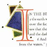
Above:
Footnotes in close-up. This shows the slanted romans in Romulus
11D.

Home |
Contents | Features
Your feedback is welcome
[an error occurred while processing this directive]
 Initial illuminated
by Thomas Ingmire for the Arion Press Bible. The basic design of the
I was by Sumner Stone, and printed from photopolymer plates
Initial illuminated
by Thomas Ingmire for the Arion Press Bible. The basic design of the
I was by Sumner Stone, and printed from photopolymer plates
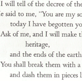 The kerning and body text type in Romulus 16 pt can be seen
here. This is a close-up of a page from Psalms.
The kerning and body text type in Romulus 16 pt can be seen
here. This is a close-up of a page from Psalms.