I can't believe it's now clutter
The latest web design trend seems
to be clutter, writes Jack Yan. Published in association
with Visual Arts
Trends
WE HAVE already been through several phases in the design of
web sites. The original ones were functional, aimed at delivering
information. Yahoo! still
retains this philosophy and its appearance hasn't greatly changed
since I first visited it in 1994 on an early Power Mac and Netscape
1.0.
Then they became more design-oriented as the
commercial web began to be exploited. A common device was the
splash screen, with a single logotype in the middle of the page.
This was fine for branding purposes, but when I put the question
to readers at the LinkExchange
Digest a couple of years ago, the consensus was that this
was passé and annoying. Still, there are some sites that
retain the splash screen "cover page".
The next generation of sites tried to create
more practicality while not losing the branding. This was prevalent
around the time I first art-directed Lucire
and the magazine retains the same principle, if not the look.
When The New York Times
launched online, it, too, followed this. The appearance is not
unlike some of the French print magazines�Capital, for
example, has various headlines splattered over its cover, divided
into rectangular sections.
Then the big wave of "portals" struck. Everyone
suddenly figured out that Yahoo!, Excite, AltaVista and others
were doing well. That must be the way! Swiss site Annabelle,
which was once among the splash screen brigade and still a very
credible fashion site, took the portal route. As did a lot of
amateur designers wanting to cash in on the web. While some
have worked because they are genuinely portals getting information
from different sources�Ninemsn
is an example�others are half-hearted. This coverless look�thrusting
the user directly into what would accurately be called a contents
page�drove me when I redesigned CAP
Online this year in favor of simplicity. Other sites
based around information, such as The
Wedding Channel, adopt this style.
From my surfing, there seems to be a move
now to combine all of these ideas into a more cluttered look
as the web evolves. Men's magazines are strong on the web and
they cater to a fairly sophisticated, affluent audience in a
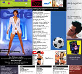
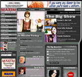
competitive market-place. Of these, both American Maxim
and Magazine Café
have the current æsthetic of having a "contents page"
as their cover and stressing the branding. A main image is also
chosen�in both cases this is regularly of a model with an unrealistic
figure.
The benefits are obvious. The brand is conveyed
through the appearance of the masthead in these cases and partly
through the arrangement of the pages. The girl catches the eye.
Then, you go down the page to see what else is on offer, hopefully
making more stops than you otherwise would.
The name of the game is visitor numbers, leading
on to banner exposures. Given that not everyone will read every
article and a new issue won't be up for another month to coincide
with the printed magazine's publication, then visitors will
take their time, read some articles (or ogle) and return later
on.
Additionally, there are square and vertical
banners to make full use of web-page real-estate. They add to
the clutter but also increase the likelihood of clickthroughs.
If an advertiser cannot catch you at the top of the page, then
maybe it can catch you at the bottom. Or at the side.
The cluttered look will not be for everyone
and should generally remain the realm of content-rich, publishing-related
sites. And it'll keep evolving.
There will be brochureware sites that don't
require visitors to visit every virtual nook and cranny but
are produced to reinforce either the brand or the client's ego.
Lucire will retain its massive pull-down menu widget�it's
not universally popular but I dislike the idea of forcing the
reader back to the contents or home page each time, which I
have to do with Maxim and Café. New sites
such as RedFilter aren't
as content-heavy and have gone with the opposite style: a clean,
contemporary look. Visual
Arts Trends itself has an organized, clear style to
the home page.
There is something to be said for the clutter:
it is not wholly impractical, it combines the movements we've
seen to date, and it's bound to be influential when carried
by two very popular stops on the web. It may even be adopted
by some amateur sites out there. Yet another sacred print rule
is turned on its head online. Watch this webspace.

Home |
Contents | Features
Your feedback is welcome
 Clutter rules at men's magazines